how food packaging colors affect consumer meal choices
The Psychology of Color in Food Packaging
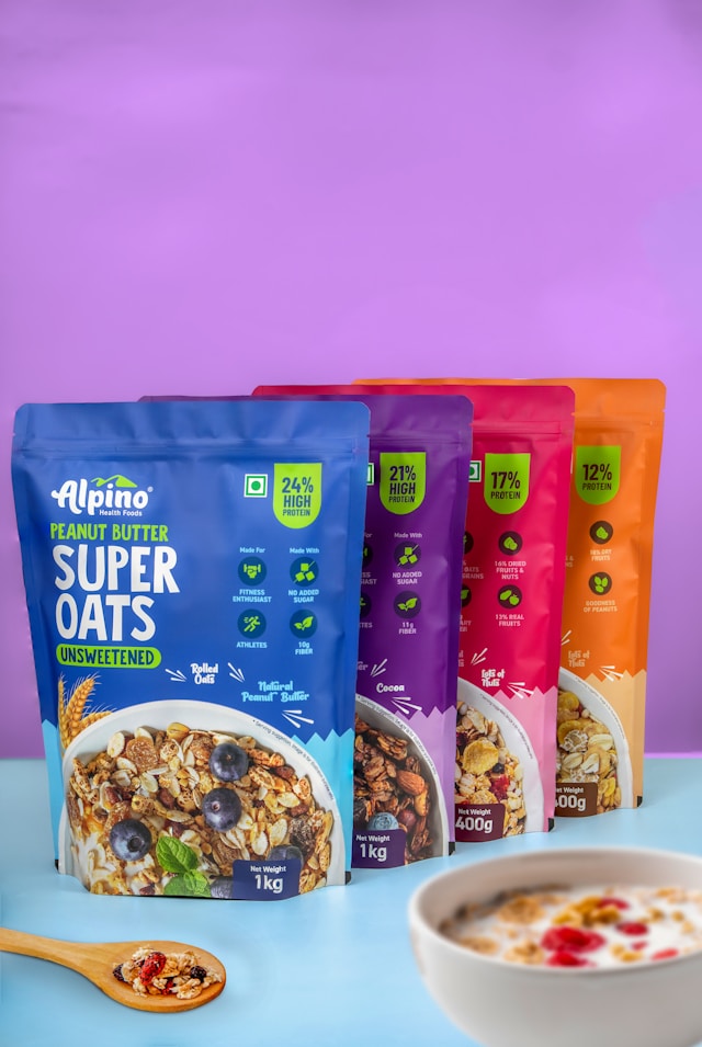
Colors have a profound impact on human emotions and behaviors, influencing decisions often at a subconscious level. This effect is particularly significant in the realm of food packaging. The choice of color can sway a consumer's perception of taste, quality, and even nutritional value. Marketing researchers have long studied the psychological effects of colors to optimize product appeal.
Case Studies Highlighting the Impact of Colors
The Red Effect: Stimulating Appetite
Red is frequently used in food packaging due to its ability to stimulate appetite and evoke strong feelings of hunger. A classic example is Coca-Cola's iconic red cans, which are associated with excitement and pleasure. Marketing research shows that products packaged in red are perceived as more flavorful and energizing.
The Green Perception: Healthy Choices
Green packaging suggests naturalness and health. Companies like Whole Foods and Green Giant utilize green to imply freshness and organic quality. Studies indicate that consumers are more likely to associate green-packaged items with healthier ingredients, often irrespective of actual nutritional content.
Blue for Trust and Freshness
While blue is less common in food packaging due to its rarity in nature's palette of edible items, it is associated with trustworthiness and purity. Brands like Tropicana have employed blue hues to convey freshness and reliability, particularly in dairy and beverage sectors.
Color's Influence on Nutritional Perception
The colors on food packaging can significantly impact consumers' nutritional judgments. For instance, a study showed that participants were more likely to judge a product with pastel packaging as lighter or lower in calories compared to the same product in darker packaging.
- Pale colors: Often associated with lightness and diet products.
- Dark colors: Generally linked to richness and indulgence.
Experimental Findings: The Snack Study
An experiment involving snack foods demonstrated that consumers ate fewer chips from packages with blue or green hues than from those with red or yellow, indicating a subconscious link between these colors and portion control or healthfulness.
Practical Tips for Health-Conscious Consumers
Understanding how packaging colors influence your choices can empower you to make healthier decisions. Here are some tips:
- Be conscious of color biases when selecting food items; don’t let packaging colors dictate health perceptions.
- Read labels for nutritional information rather than relying solely on packaging color cues.
- If aiming to reduce caloric intake, consider how certain colors might subconsciously encourage larger consumption.
A Mini-Framework for Healthier Shopping Decisions
To help consumers make more informed choices, here's a simple framework:
- Pause: Take a moment to recognize your emotional response to a product's packaging.
- Evaluate: Check the nutritional facts and ingredients list.
- Reflect: Consider your health goals and whether this choice aligns with them.
This framework encourages mindfulness in shopping, reducing the likelihood of impulsive decisions driven by color psychology.
Conclusion: The Subtle Art of Packaging
The colors used in food packaging play a subtle yet powerful role in shaping consumer behavior. By being aware of these influences, both marketers can better tailor their strategies, and consumers can make more informed dietary choices. Understanding the intricate relationship between color psychology and consumer behavior offers valuable insights into our everyday eating habits and how we perceive nutrition through the lens of color.